Creative Design
Typography Matters: How Fonts Influence Brand Perception


Picture this: You walk into a coffee shop, and everything about it screams artisanal and cosy. The signage has a beautiful handwritten script, the menu is in a sleek, minimalist sans-serif, and even the coffee cup features elegant typography. Without even taking a sip, you already feel like you’re about to enjoy a premium experience. That’s the power of typography in branding.
As a creative designer, I can tell you that fonts do more than just display words, they set the tone, evoke emotions, and shape brand perception. The right typeface can build trust, reinforce identity, and even influence consumer behaviour. So, let’s break it down: how exactly does typography impact a brand’s image?
Just like people, fonts have their own unique personalities. A bold, all-caps sans-serif like Helvetica conveys strength and modernity, while a delicate script font like Dancing Script feels elegant and personal. When choosing a font, ask yourself: What personality does my brand have? Is it playful, serious, luxurious, or approachable? Your typography should reflect that.
Ever landed on a website with a hard-to-read font? Chances are, you didn’t stick around for long. Readability is key in building trust and keeping your audience engaged. Simple, clean fonts (like Open Sans or Lato) make it easy for users to digest information, while overly decorative fonts can create confusion. A good rule of thumb? If your grandma struggles to read it, reconsider your choice.
A well-thought-out font pairing can take a brand from ‘meh’ to memorable. The secret? Contrast and balance. Pair a bold headline font with a more neutral body font to create hierarchy and clarity. Think classic duos like Montserrat & Lora or Roboto & Merriweather, these combinations feel natural and professional without being overwhelming.
Typography isn’t just about the letters themselves, it’s also about how they’re presented. Spacing (kerning, tracking, and leading) affects how easy it is to read, while colour choices can evoke different emotions. A black serif font on a white background feels timeless and authoritative, whereas pastel-coloured text might feel playful and lighthearted. Every little detail counts.
Think of brands like Coca-Cola, Nike, or Disney, each one has a signature typeface that makes it instantly recognisable. Typography helps build a visual identity that sticks in people’s minds. Whether it’s a custom font or a carefully chosen typeface, consistency is key to making your brand memorable.
Typography is more than just an aesthetic choice, it’s a strategic tool that shapes how people perceive your brand. Whether you’re designing a logo, a website, or packaging, choosing the right fonts can make all the difference. So, the next time you’re picking a typeface, think beyond just what looks good, consider how it makes people feel.
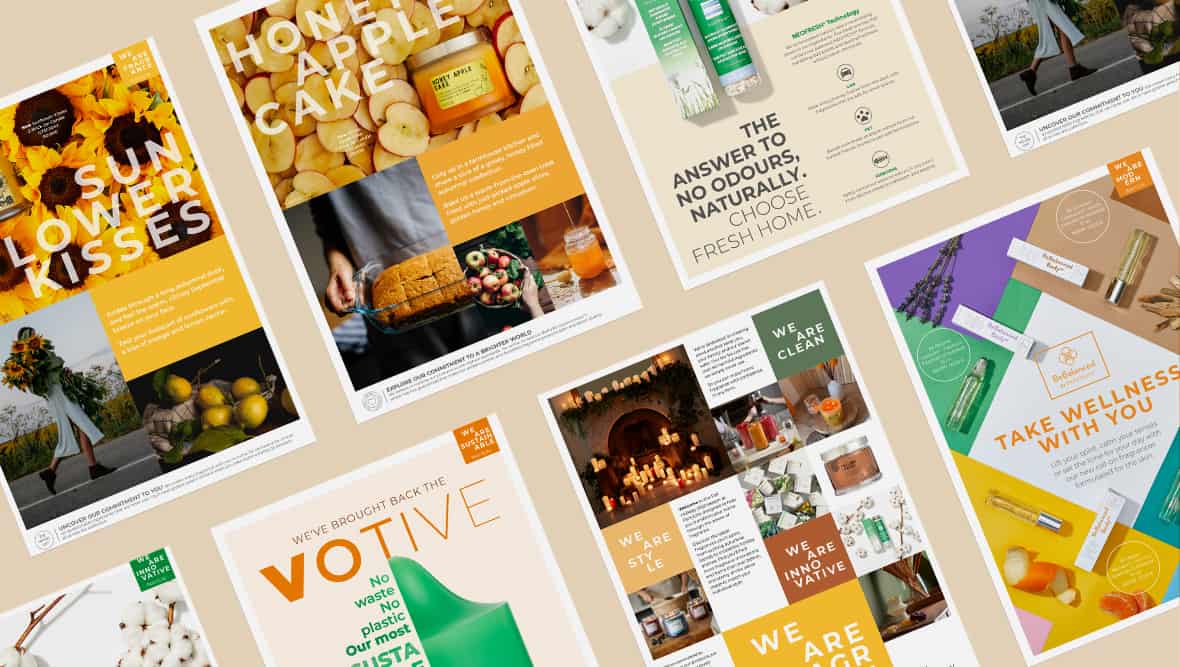
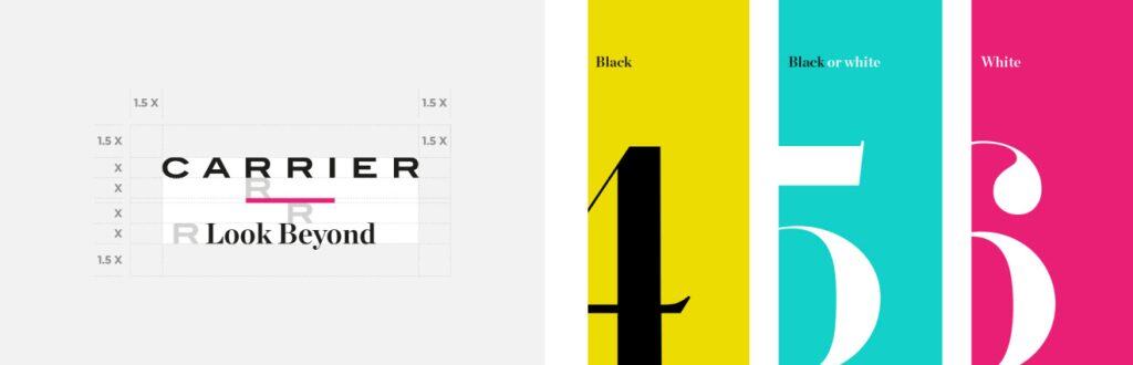
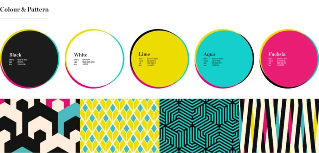
Want to see how we do it? Take a look at our case study here.
Need help finding the perfect typography for your brand? Let’s chat, and we can help bring your brand’s personality to life, one letter at a time.


Parish Rooms,
Niven St.
Manchester,
M12 6PQ
+44 (0) 161 273 7551
The Piper Building
Peterborough Road,
London,
SW6 3EF
+44 (0) 20 7751 8600
03, Siddhi CHS Ltd,
Mhada Malad East
near Wageshwari Temple,
Khadakpada,
(W) Mumbai
400097